
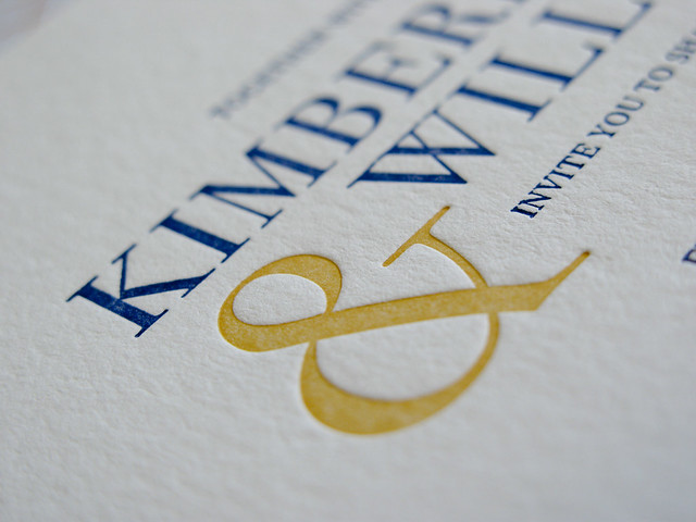

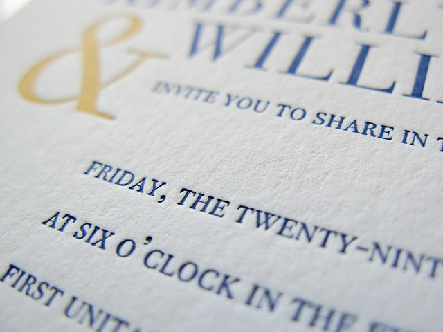
The bride & groom wanted modern & simple & not something they'd look back on in ten years and say "HELLO 2011". Fait accompli methinks.
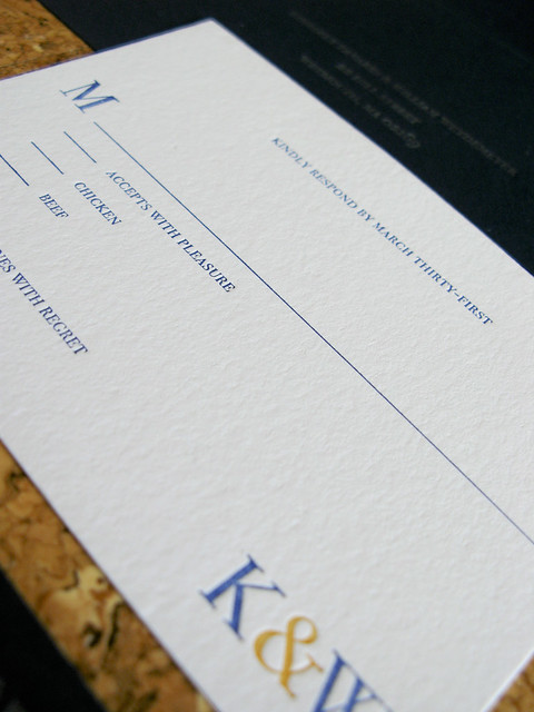
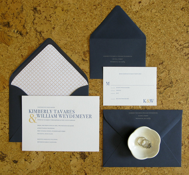
Navy & Poppy on Lettra 110 Flo White. Matching Navy envelopes with custom liners. Return address in Silver. Hopefully my last mag on wood job EVER.
So how are my pictures looking? Good? I am loving this depth-of-field shit. Every time I mess with it I think back to my one photo class in collage and how I totally bombed the depth-of-field project. I just could not grasp the concept for some reason. I'd like to blame the 20-ish year old camera I was using, but in hindsight it was probably just a hangover. Do you think they could be a bit brighter? I'm finding it hard to draw the line between "bright" and "blown out".
Beautiful! And they look even better in person;) Sigh, I just love those envelope liners. Definitely like the product photos with props - wedding rings are a great touch. And yes, it is so hard to get the pics (especially the white of the paper) to come out bright enough without being blown out. I also have trouble with the pics looking different when I upload them depending on where I'm hosting them, annoying!
ReplyDeleteHi Holly!
ReplyDeleteThanks so much for your blog comment! Being so isolated as a creative biz, its so wonderful when people share similar moments/fears. I truly appreciate your willingness to share.
On to more fun things > so far your projects are lovely! Can't wait for you get many many more!